5 minutes
Stacked area charts
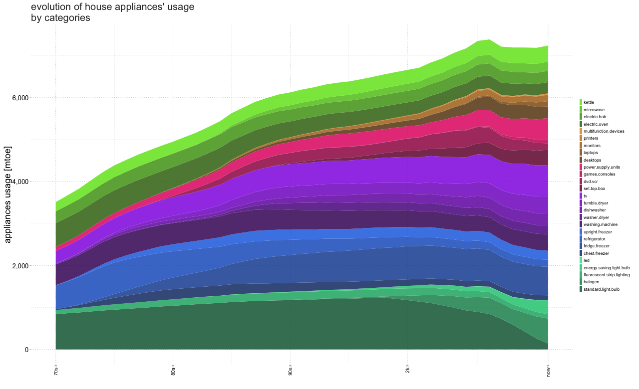
The following example presents the evolution of house appliances’ usage along the period from 1970 to 2012. For such a example, the source of the data is not relevant.
The libraries used in this example are: ggplot21, scales2, colortools3, plyr4, dplyr5, reshape26.
  library(ggplot2)    # grammar of graphics library
  library(scales)     # to provide some format on the plots
  library(colortools) # to make color functions
  library(plyr)       # fit for purpose data tool
  library(dplyr)      # a grammar of data manipulation
  library(reshape2)   # adapts dataframes for optimal plotting
To start, the original table .xls is fixed and transformed to a
comma-separated values file .csv to be then easily managed in R.
  dB.apps_mtoe <- read.csv("dataEvolutionApps.csv")
    rownames(dB.apps_mtoe) <- dB.apps_mtoe$Year
      dB.apps_mtoe$Year <- NULL

      dplyr::tbl_df(dB.apps_mtoe)
Source: local data frame [43 x 28]
Year Standard.Light.Bulb Halogen Fluorescent.Strip.Lighting Energy.Saving.Light.Bulb LED Chest.Freezer Fridge.freezer Refrigerator
(int) (int) (int) (int) (int) (int) (int) (int) (int)
1 1970 841 0 97 0 0 22 0 569
2 1971 863 0 103 0 0 43 0 612
3 1972 882 0 108 0 0 68 17 652
4 1973 906 0 115 0 0 97 35 698
5 1974 928 0 121 0 0 127 60 737
6 1975 949 0 127 0 0 155 91 750
7 1976 966 0 132 0 0 181 126 739
8 1977 985 0 137 0 0 204 164 715
9 1978 1004 0 143 0 0 222 202 686
10 1979 1025 0 148 0 0 235 240 659
.. ... ... ... ... ... ... ... ... ...
Variables not shown: Upright.Freezer (int), Washing.Machine (int), Washer.dryer (int), Dishwasher (int), Tumble.Dryer (int), TV (int),
Set.Top.Box (int), DVD.VCR (int), Games.Consoles (int), Power.Supply.Units (int), Desktops (int), Laptops (int), Monitors (int), Printers
(int), MultiFunction.Devices (int), Electric.Oven (int), Electric.Hob (int), Microwave (int), Kettle (int)
Then, in order to have a visual aim in the graphic, categories are added to each of the columns.
And finally, a common practice when using ggplot is to melt the data frame to a reduced number of columns: variable, value and category.
  names(dB.apps_mtoe) <- tolower(names(dB.apps_mtoe))
  dB.apps_mtoe.melt <- suppressMessages(melt(dB.apps_mtoe))
    dB.apps_mtoe.melt$Year <- seq(1970, 2012)
    dB.apps_mtoe.melt$System <- "-"
      dB.apps_mtoe.melt$System[1:215] <- "Lighting"
      dB.apps_mtoe.melt$System[216:387] <- "Cold"
      dB.apps_mtoe.melt$System[388:559] <- "Wet"
      dB.apps_mtoe.melt$System[560:774] <- "Brown"
      dB.apps_mtoe.melt$System[775:989] <- "Computing"
      dB.apps_mtoe.melt$System[990:1161] <- "Cooking"
    dB.apps_mtoe.melt$.type <- as.factor(dB.apps_mtoe.melt$variable)
    dB.apps_mtoe.melt$variable <- as.factor(dB.apps_mtoe.melt$Year)
    dB.apps_mtoe.melt$value <- as.numeric(dB.apps_mtoe.melt$value)
    dB.apps_mtoe.melt$.subtype <- dB.apps_mtoe.melt$System
    dB.apps_mtoe.melt$Year <- dB.apps_mtoe.melt$System <- NULL
    #dB.apps_mtoe.melt <- dB.apps_mtoe.melt[order(dB.apps_mtoe.melt$.subtype),]

  dB_categories <- as.data.frame(aggregate(dB.apps_mtoe.melt["value"],
                by=dB.apps_mtoe.melt[c(".type",".subtype")], FUN=length))
    dB_categories$.type <- as.character(dB_categories$.type)
    dB_categories$.subtype <- as.character(dB_categories$.subtype)
    dB_categories$value <- NULL
  dB_categories <- plyr::count(dB_categories, ".subtype")
To improve visualisation, a vector of colors is assigned in regard to the number of elements on each category. This vector is created with small function to define both contrast and related colors among the groups. This vector is passed then to the plot-function which also calls for the type of plot and a facet flag.
  colorCategories <- function(DataToBePlotted, colorId = "#606FEF",
                              levelSat = 0.85){
    DataToBePlotted$col <- setColors(colorId, dim(DataToBePlotted)[1])
    DataToBePlotted$new <- ""
    DataToBePlotted.types <- dim(DataToBePlotted)[1]

    for(i in 1:DataToBePlotted.types){
      ColorSet <- sequential(DataToBePlotted$col[i], 1, what = "value",
                             s = levelSat, alpha = 1, fun = "sqrt", plot=F)
      firstColor <- floor(length(ColorSet) / (DataToBePlotted$freq[i]*4+1))
      groupColor <- NULL;
      for(j in 1:DataToBePlotted$freq[i]) groupColor[j] <- ColorSet[firstColor*j*4]
      DataToBePlotted$new[i] <- paste(groupColor, collapse=",")
    }

    outputColors <- paste(DataToBePlotted$new,collapse=",")
    outputColors <- unlist(strsplit(outputColors, ","))
    return(outputColors)
  }

  drawAppsTyp <- function(DataToBePlotted, cbbPalette, typePlot="stack", facets=F,
                          titleGraph, xAxis, yAxis){
    DataToBePlotted$variable <- as.numeric(as.character(DataToBePlotted$variable))
    DataToBePlotted$.subtype <- as.factor(DataToBePlotted$.subtype)
    g <- ggplot(DataToBePlotted, aes(variable, value, fill=.type)) +
      geom_ribbon(aes(ymin=0, ymax=value), position = typePlot, alpha = 0.84) +
      xlab(xAxis) +
      ylab(yAxis) +
      ggtitle(titleGraph) +
      theme(
        axis.text = element_text(color = "black", size = 13,
                                 margin=unit(0.04, "in")),
        axis.text.x = element_text(angle = 90, vjust = 0.5, hjust = 1, size = 10),
        axis.title = element_text(size = 18, vjust = 0.8),
        legend.position = "right",
        legend.background = element_rect(fill="transparent"),
        legend.key = element_rect(fill = "white", color = "white"),
        legend.key.width = unit(0.25, "in"),
        legend.key.height = unit(0.25, "in"),
        legend.title = element_blank(),
        panel.grid.major = element_line(colour = "gray",linetype = "dotted"),
        panel.grid.minor = element_line(colour = "gray",linetype = "dotted"),
        panel.background = element_rect(fill = "transparent"),
        axis.ticks = element_line(colour = "gray"),
        axis.ticks.x = element_line(size = rel(4)),
        plot.background=element_blank(),
        plot.title = element_text(colour = "#2E2E2E", size = 20,
                                  hjust = 0, vjust = 2, angle = 0)
      ) +
      scale_x_continuous(breaks=c(1970,1980,1990,2000,2012),
                         labels=c("70s", "80s", "90s", "2k", "now")) +
      scale_y_continuous(labels=comma) +
      guides(fill=guide_legend(title=NULL, reverse=T,
                               label.position="right", keywidth = 0.5,
                               keyheight = 1,
                               nrow = length(unique(DataToBePlotted$.type)))) +
      scale_fill_manual(values=cbbPalette) +
      labs(fill = "variable")

    if(facets==T){
      g + facet_wrap(~ .subtype, shrink = TRUE, scales="free_y")
    }else{
      g
    }
  }

  ColorSet <- colorCategories(dB_categories,"#2ea473", 0.88)

  drawAppsTyp(dB.apps_mtoe.melt, ColorSet, "fill", T,
                    "evolution of house appliances' usage \nby categories",
                    "","appliances usage")
The first plot presents the accumulated stacked data to see the overall evolution.
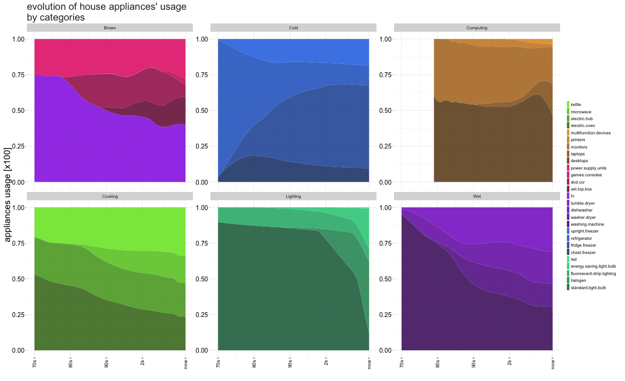
However, since some of the elements contain very low values, an alternative might be to separate the plot by categories and to represent them in a percentage (or normalised) way.
As seen, ggplot is flexible and may be used with ease for reproducible documentation.
I hope this has been useful.
[- Download dataEvolutionApps]
- H. Wickham. ggplot2: Elegant Graphics for Data Analysis. Springer-Verlag New York, 2009. [return]
- Hadley Wickham (2016). scales: Scale Functions for Visualization. R package version 0.4.0. [return]
- Gaston Sanchez (2013). colortools: Tools for colors in a Hue-Saturation-Value (HSV) color model. R package version 0.1.5. [return]
- Hadley Wickham (2011). The Split-Apply-Combine Strategy for Data Analysis. Journal of Statistical Software, 40(1), 1-29. [return]
- Hadley Wickham and Romain Francois (2015). dplyr: A Grammar of Data Manipulation. R package version 0.4.3. [return]
- Hadley Wickham (2007). Reshaping Data with the reshape Package. Journal of Statistical Software, 21(12), 1-20. [return]